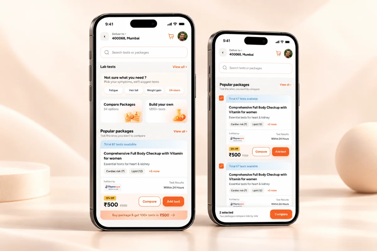
From a Health score to a Health story
I redesigned OHA’s Health Score to turn diagnostics, vitals, lifestyle and mental wellness data into a clearer picture of health, then connect that picture to personalised actions and ongoing support.
Information Architecture · UI
2 product designers · 7 developers
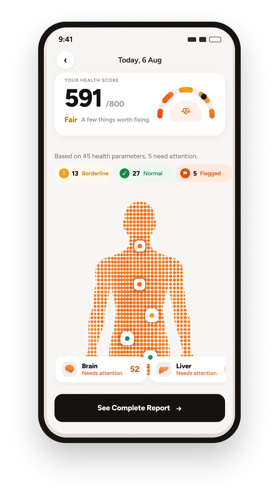
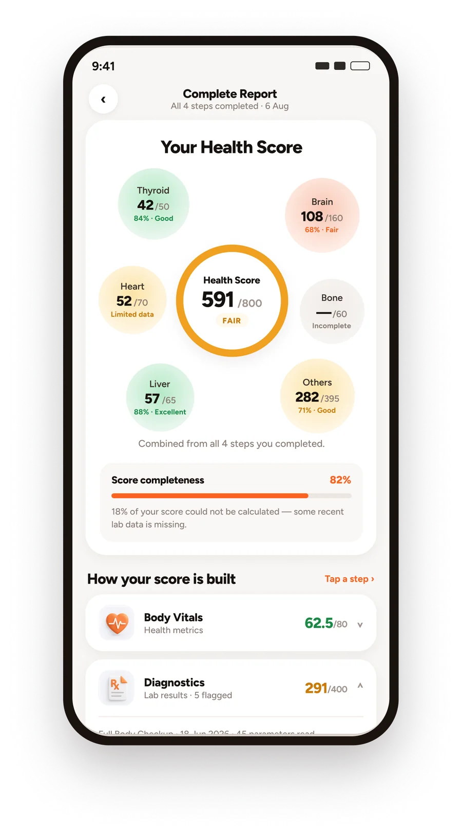
How we turned OHA’s 800-point Health Score into a personalised health journey. Four assessment areas become one score but the score is only the beginning. Users drill into the areas affecting their health, understand individual markers, get personalised recommendations and build an 8-week plan around the actions that matter most.
“I have all these health numbers. But what do they actually mean for me?”
A person’s health doesn’t live in one place. Vitals tell one story. Lab reports tell another. Daily habits add another layer. Mental wellbeing adds another.
Every number was available. None of them added up to an answer.
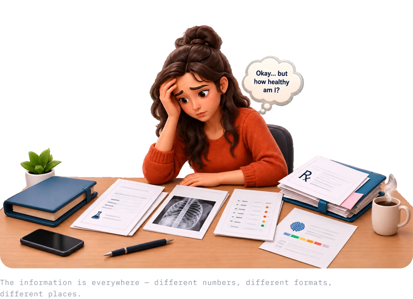
Users weren’t looking for another dashboard. They were looking for clarity.
People want a verdict they can trust, not a value they have to interpret. A number alone doesn’t settle the question.
A verdict without a reason feels like a guess. They need to see which part of their health pulled the number where it landed.
Understanding only matters if it ends in a move they can actually make this week, without a clinician to translate it.
From showing people their health data
That reframing is what made a single Health Score worth building not as a summary of the data, but as the thing that answers all three questions in one place.
To helping them understand it and act on it.
A Health Score can still leave you with one very simple question.
One score built from four dimensions of health.
The Health Score brings four different health signals together to give users one starting point, while still letting them see what is contributing to the result.
{{ d.desc }}
But a single number isn’t enough. The next question is what is affecting my score, and where should I pay attention?
A score tells you where to look. The detail tells you what to do.
So we made every health area explorable. A user can tap a risk area, see the parameters contributing to it, understand what a result means, track how it is changing over time, and get a personalised action in the same flow.


Knowing what needs attention is only the first step.
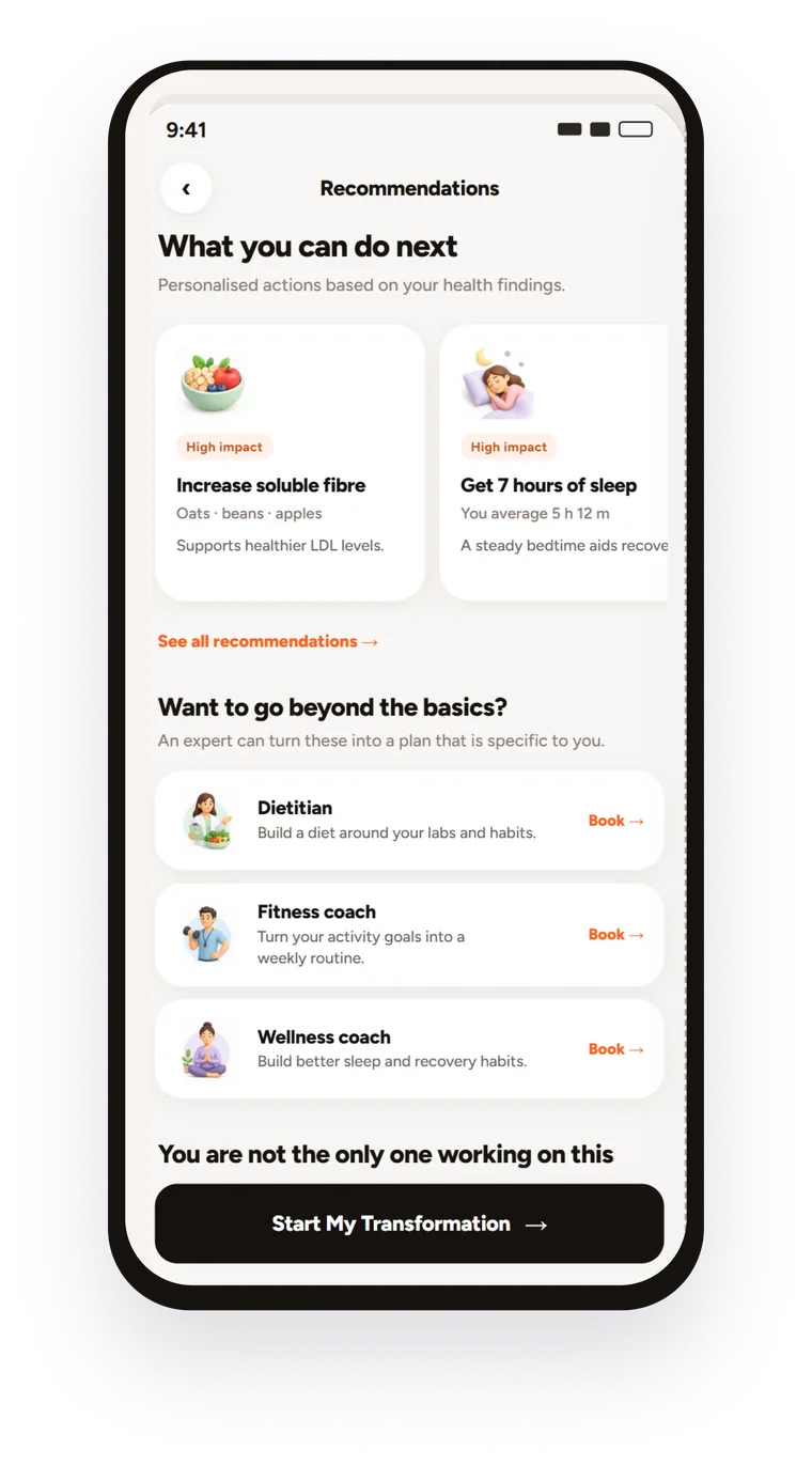
The next question is what the user can actually do about it. Recommendations translate flagged health areas into practical changes across nutrition, activity, lifestyle and wellbeing, so the score becomes a starting point for action, not just another number.

More fibre, fewer processed foods, earlier meals.

30 minutes of walking, strength work twice a week.

A consistent sleep routine and guided practices.
Health improvement needs support, not just advice.
Some changes start with a daily habit. Others are easier with people, guidance and structured care, so recommendations connect to support matched to the areas the assessment flagged.
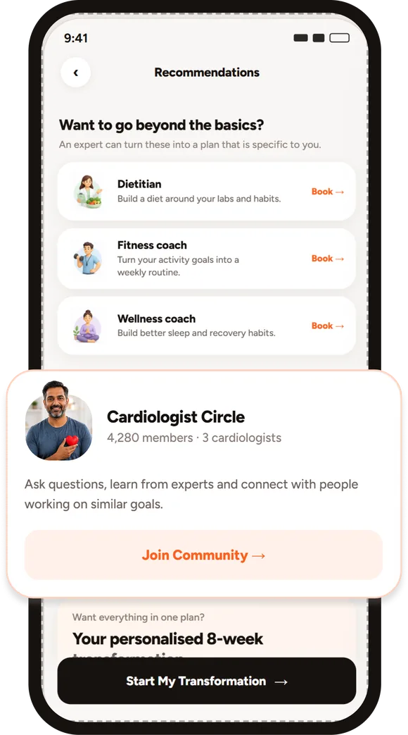
Heart Health, Stress & Sleep or Gut Health, matched to the user’s priority areas.
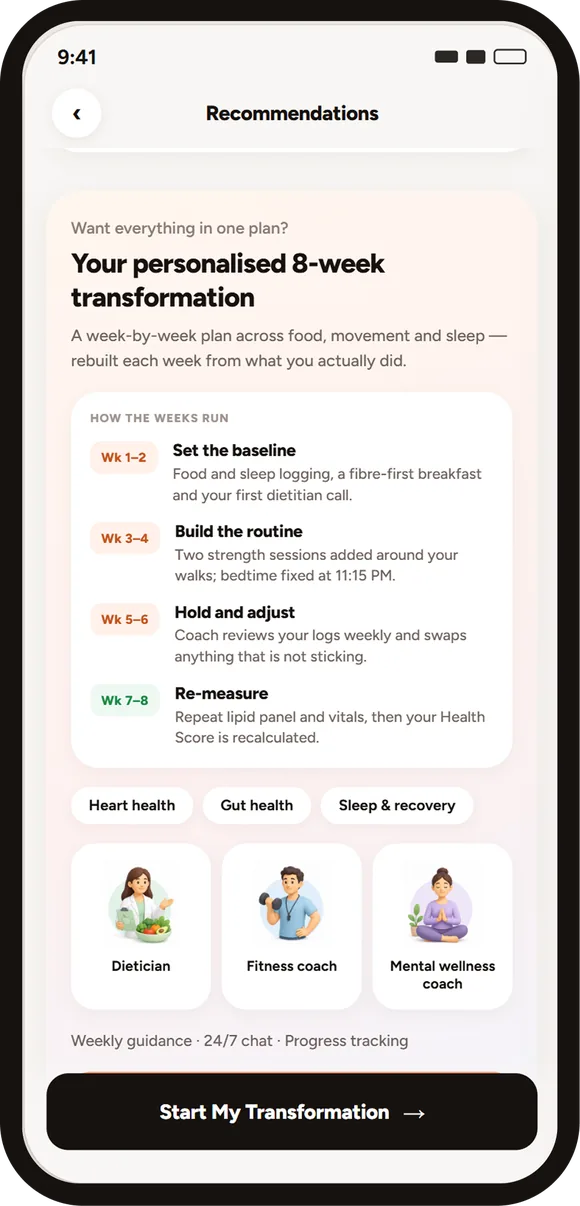
Consultations, coaching, diagnostics or follow-up care based on the user’s health priorities.
The Health Score became more than a number.
Users can understand what contributes to their health score.
Findings are translated into specific, personalised recommendations.
Users are connected to relevant communities and care programmes.
The score becomes a starting point for ongoing health improvement.