←Back to home Lab Diagnostics
Case Study · Healthcare · Lab Diagnostics

Making Lab-test packages easier to choose

Turning scattered health signals into a story people can understand, act on, and keep improving.
Role
Product Designer
Domain
Preventive Healthcare · AI
Platform
Mobile App (iOS & Android)
Timeline
2 weeks
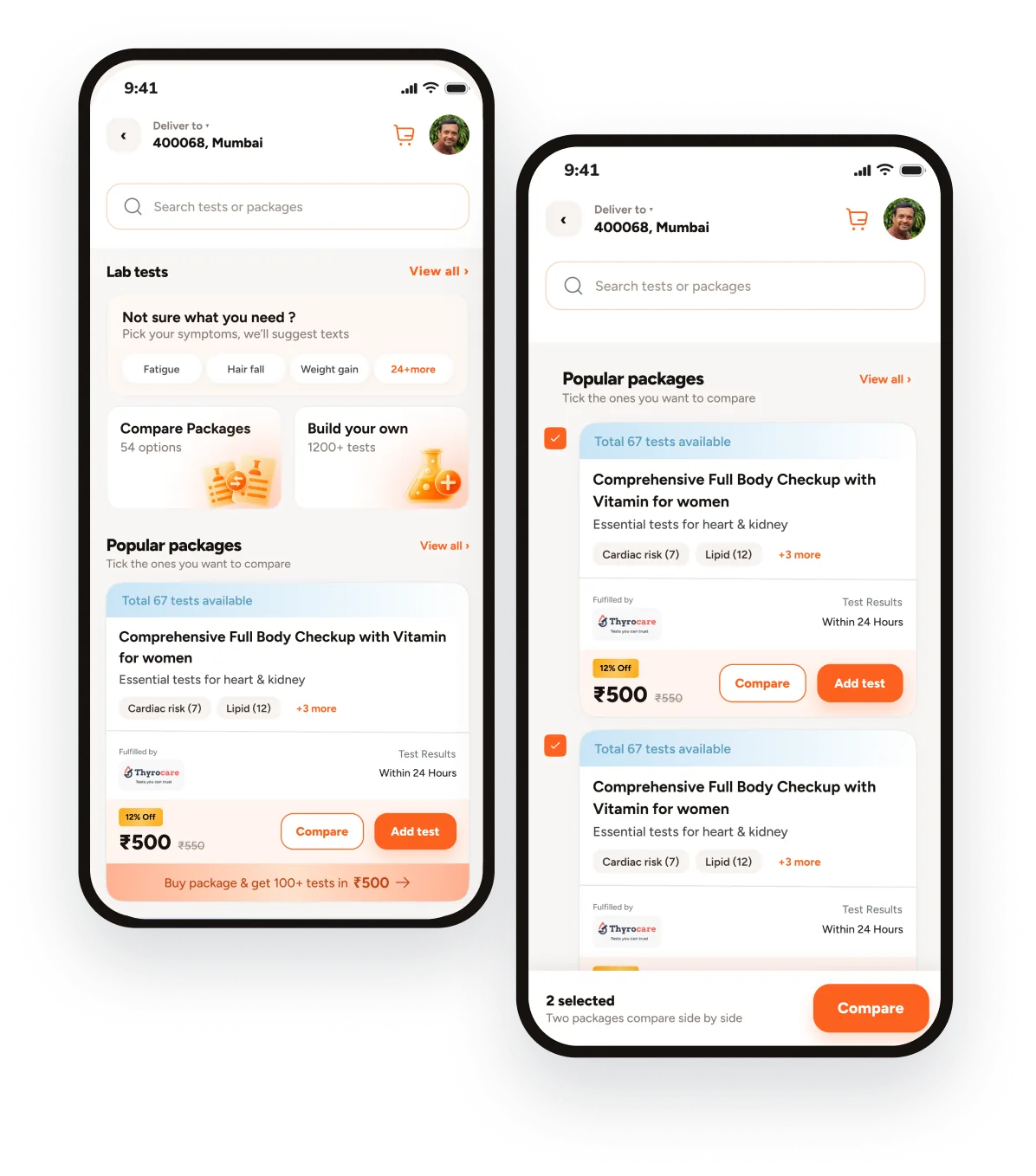
Two phone screens: the lab tests landing page and the popular packages list with two packages ticked for comparison
TL;DR

Users aren't struggling to find a lab test. They're struggling to know which package is right for them. I moved package discovery from catalogue-first to need-first: a user starts with a health concern, sees only relevant packages, and compares them on what the extra parameters actually add not on how many tests are in the box

The user’s problem

The problem wasn't finding a test. It was knowing what to choose.

Someone searches
PCOD tests

Knows the concern, not the parameters

Another searches
TSH + FSH + LH

Knows exactly what they need

When users don't know which parameters matter, a long list of packages doesn't help them decide. It makes the decision harder

Three friction points
01
There were too many choices to make

Multiple packages can appear relevant, but the differences between them aren't immediately obvious.

02
Medical terminology creates uncertainty

Users may recognize a health concern but not know which parameters are relevant to it.

03
Comparing means doing the work yourself

Users compare packages to see what’s included, what’s missing, and whether upgrading is worth it.

The interface gave users options, but not enough context to make the choice feel easy.

User research

I started by looking at how people are asked to choose today.
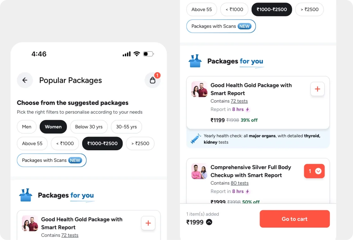
Marketplace A: Popular Packages with filters for gender, age and price, and suggested packages
Marketplace A

Already offers package categories such as women's health, lifestyle checkups and health concerns, alongside individual tests and full-body packages. It also provides a package comparison view.
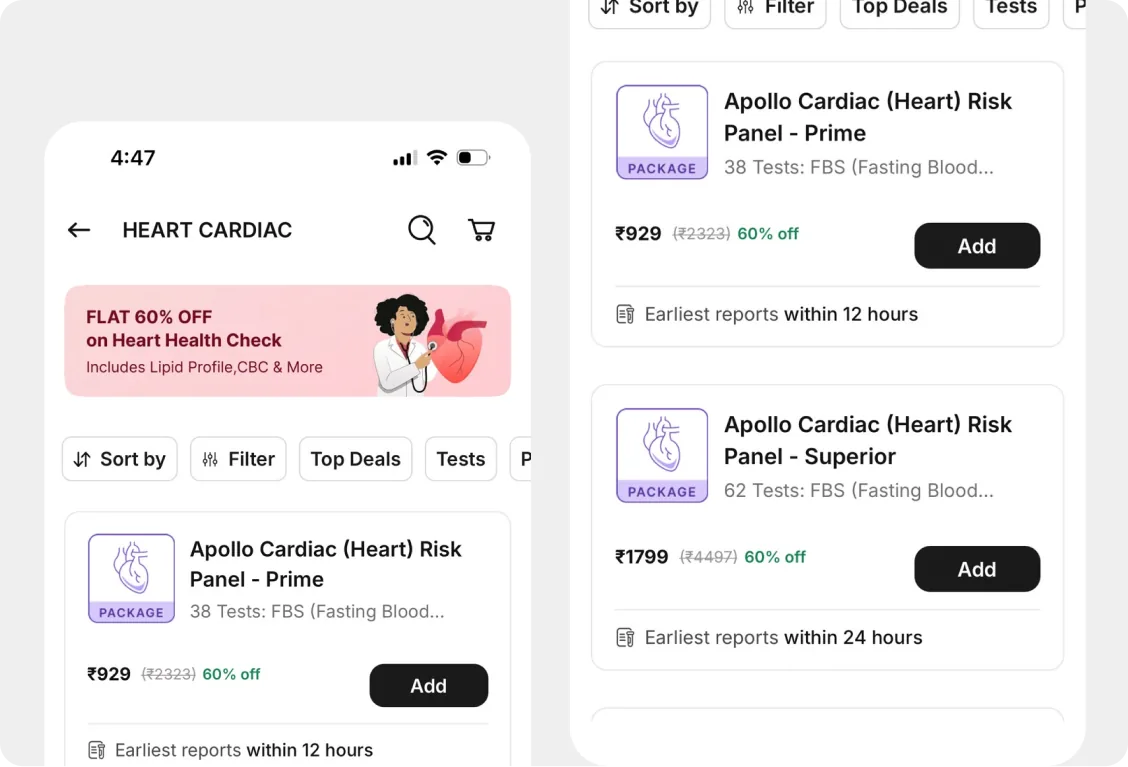
Marketplace B: Heart Cardiac category listing cardiac risk panels
Marketplace B

Similarly offers a broad range of packages organized around preventive health and specific concerns such as diabetes, thyroid, PCOD, fertility and women's health

Both platforms make a large catalogue discoverable.
The opportunity I saw was to make that catalogue easier to navigate when the user starts with a health concern rather than a test name.

Design opportunity

What if users could start with what they know?

“I have symptoms related to PCOD. What should I check?”
The core design decision

I shifted package discovery from catalogue-first to need-first.

Old mental model
“Which package should I browse?”
New mental model
“What are you looking for?”
What are you looking to check?

Choose a health concern and we’ll show you relevant packages
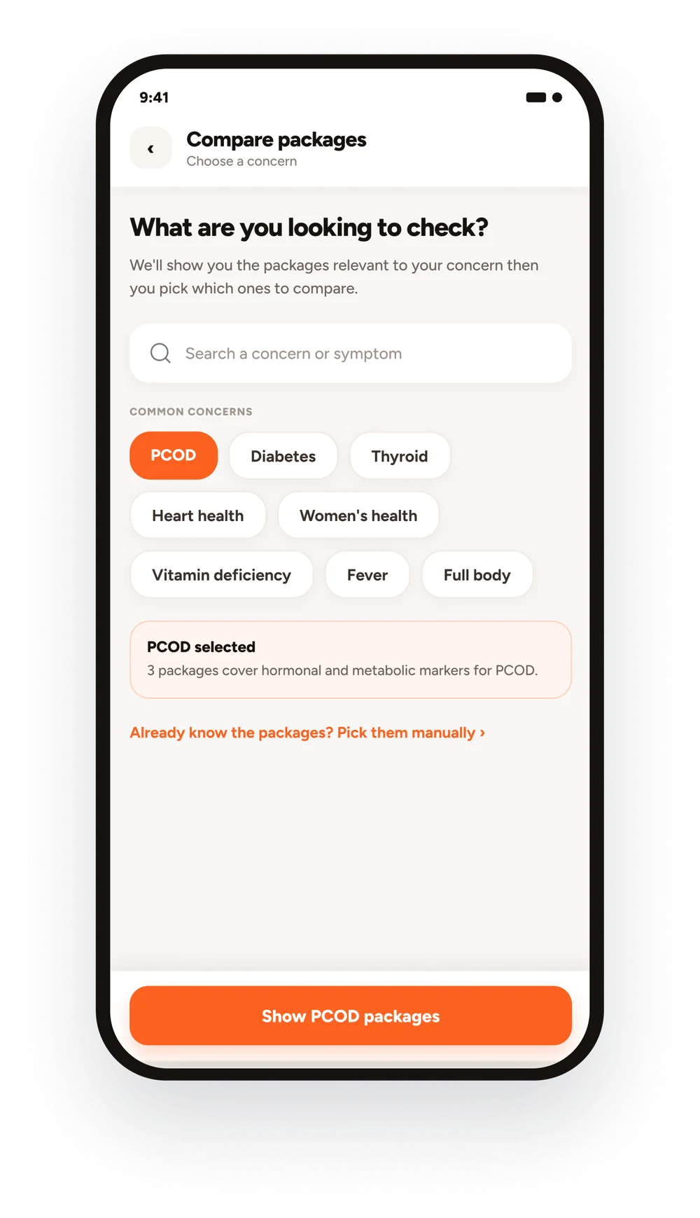
Tell us what you’re looking for
Compare packages screen: What are you looking to check? with PCOD selected among common concerns and a Show PCOD packages button
The comparison experience

From “Which one?” to “Here's the difference.”

Once the user selects PCOD, packages aren't just listed. They're shown in a way that supports a decision.
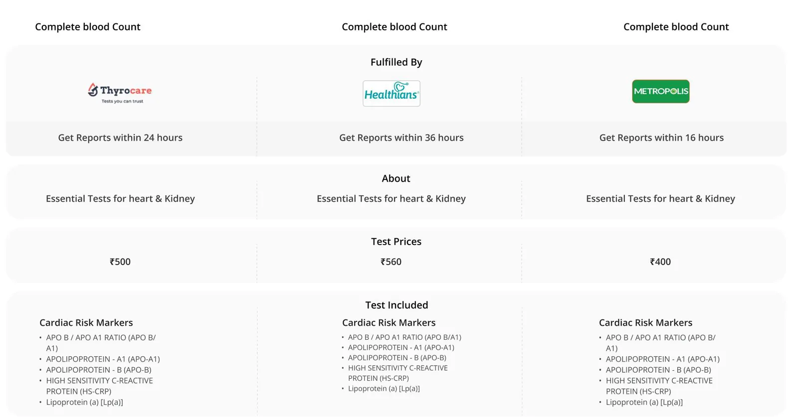
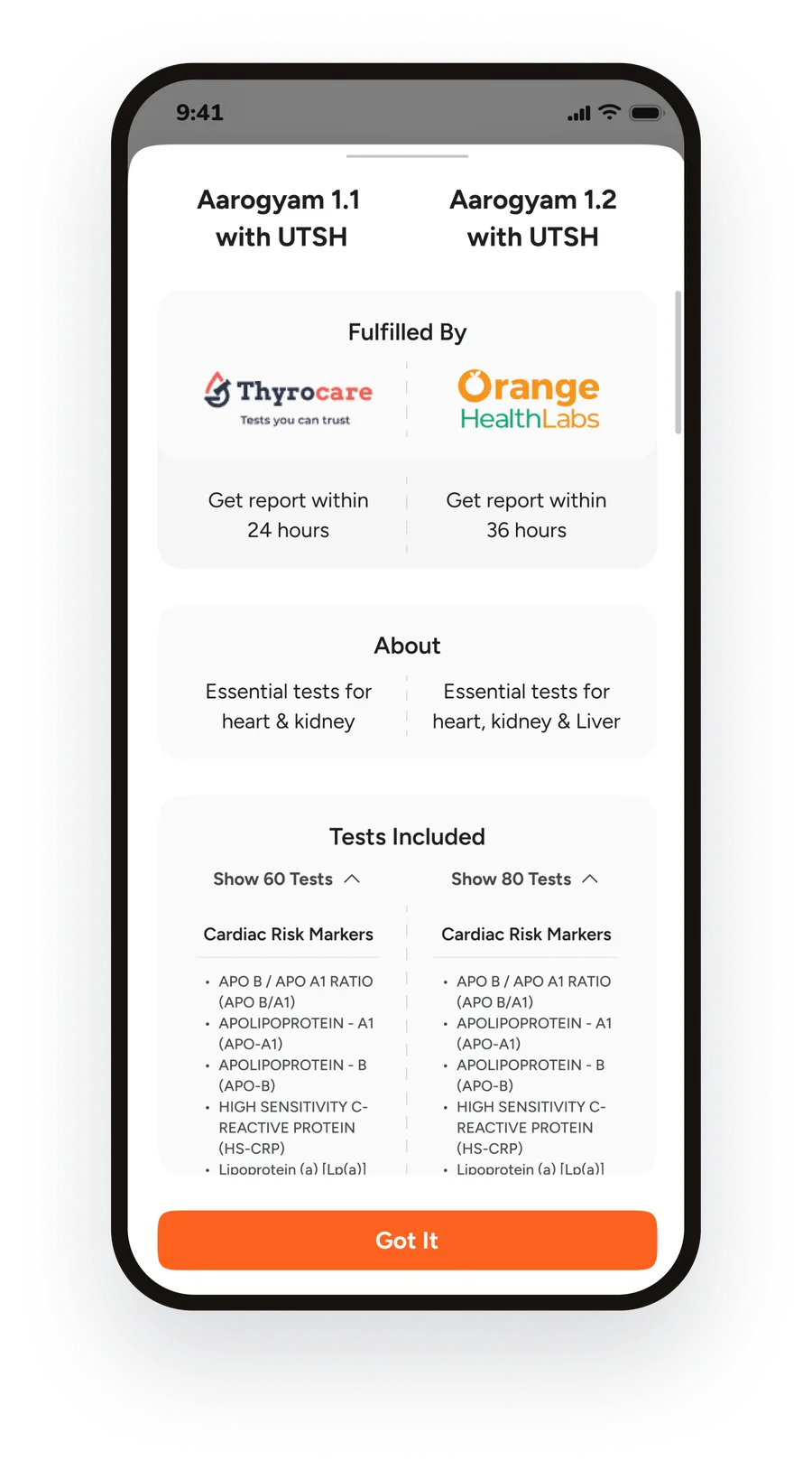
Comparison view: the same package from Thyrocare, Healthians and Metropolis compared by report time, about, price and tests included
The new lab test experience

From finding a test to finding what fits.
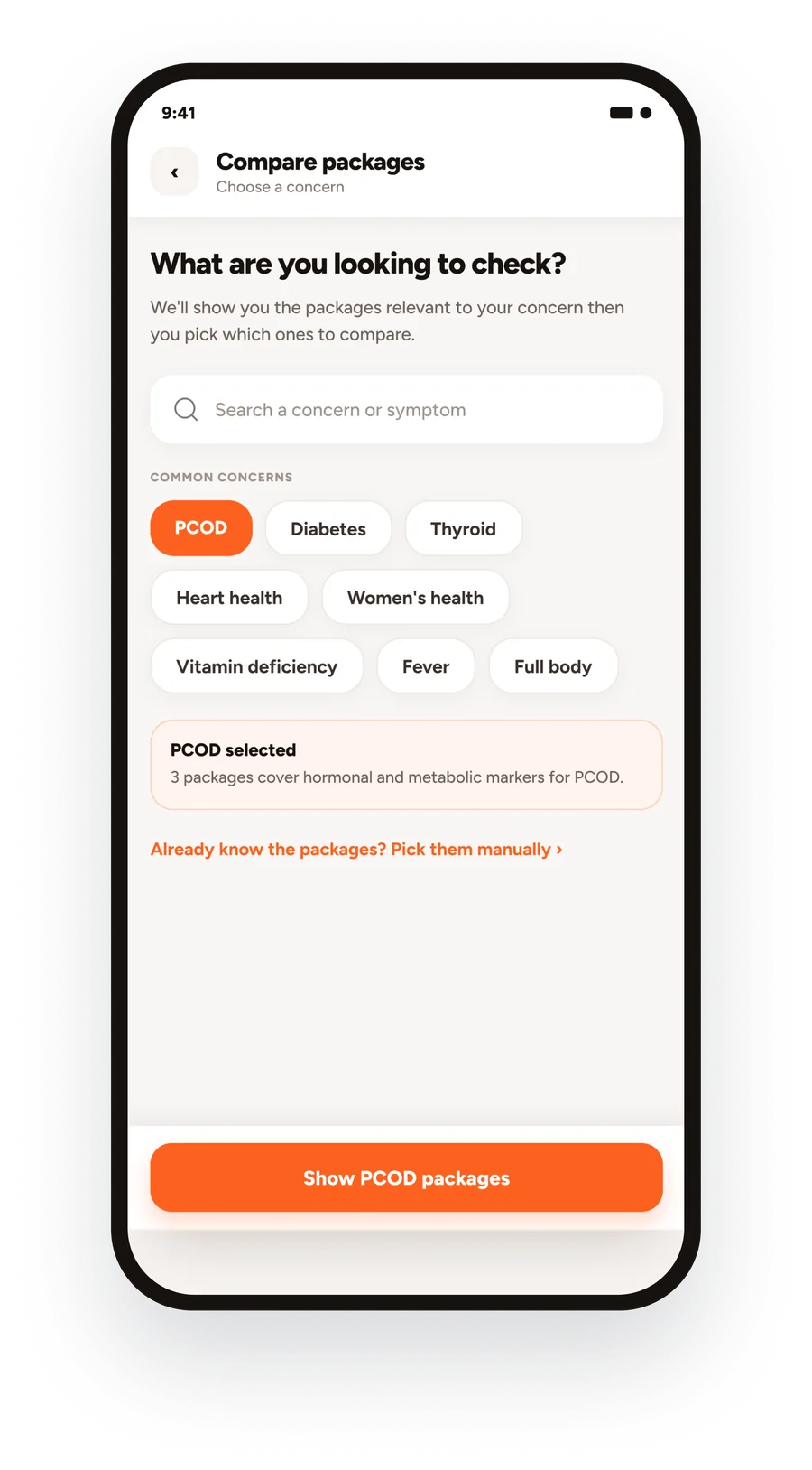
Choose a health concern: PCOD selected
Start with a concern
Find packages that fit
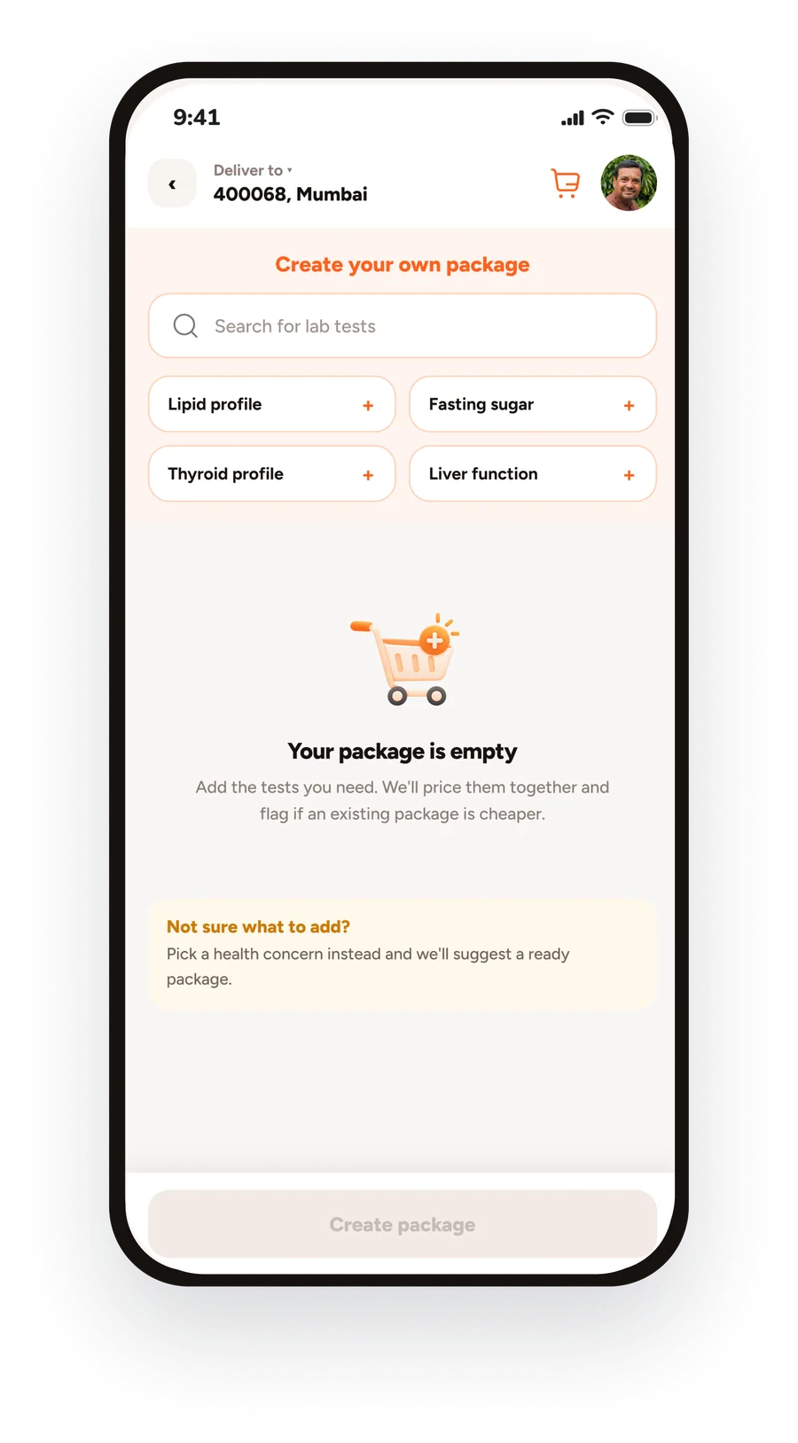
Create your own package: pick individual tests
Build your own
Choose the tests you need
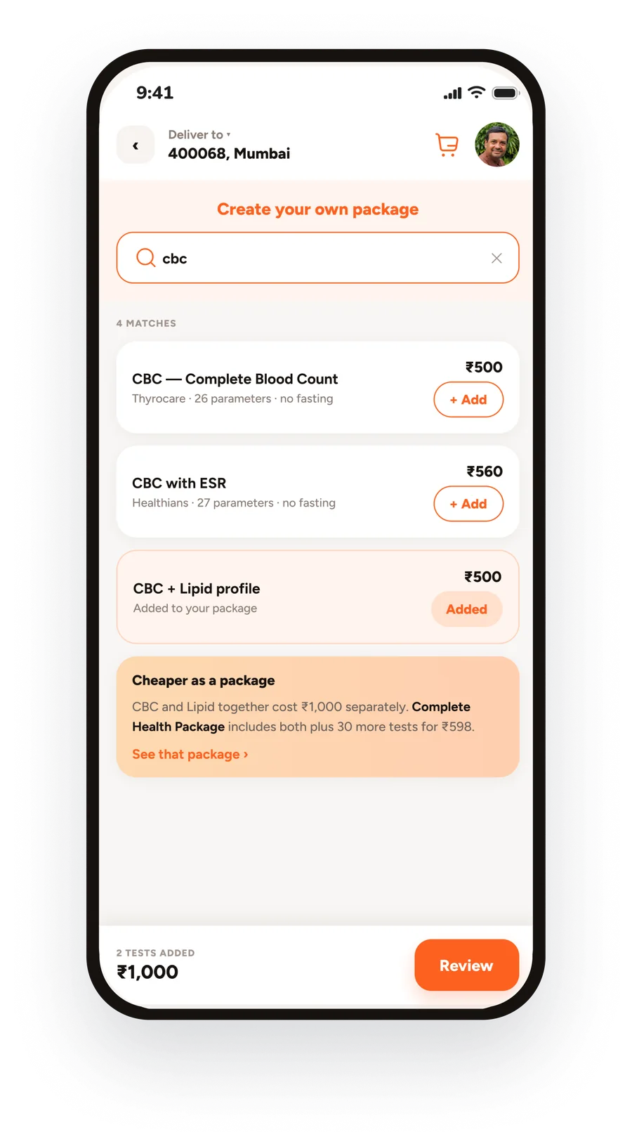
Custom package with a nudge that a ready package is cheaper
Make an informed choice
Know when a package makes more sense
Compare packages side by side
Compare packages
See what’s different
The outcome

The redesign changed the role of the landing page.

From
A catalogue of tests and packages
To
A starting point for making a health-testing decision
Less cognitive load

Users can start with a concern rather than a test name.

More confident comparison

Package differences become visible instead of requiring mental comparison.

Better discovery

Users can move from a symptom or concern to relevant testing options
Good healthcare UX doesn't just give people more options. It helps them understand which option makes sense for them.
Let’s work together

Have a product that needs this kind of thinking?

Hire me
Lab-Test Packages · Case study 2 of 3
← Back to home Back to top ↑
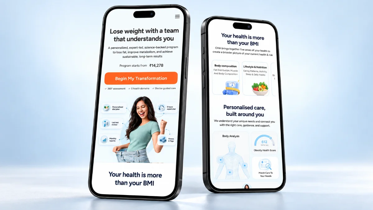
Next case study Selling obesity care, not another diet plan A mobile landing page that sells medical care, not a target weight. Read the OHA Obesity Care case study →
OHA obesity care landing page on two phones
← Previous: OHA Health Score
Jump to
Next: OHA Obesity Care → ← Back to home